

Challenge
In 2017, I enrolled in a design class for the first time in my life to enhance my marketing skillset. The final project for my design coursework at RIO Class required all students to create a full branding package for any marketing promotion of our choosing.
Establishing project focus
After some research, I laid down some direction for the design as follows:
- Key message: “No mercy”.
- With preexisting tension between the two martial arts superstars — Floyd Mayweather in boxing and Connor McGregor in MMA — and surrounding hype from fans dying to see the fight, I thought a message that hints at a potential all-out brawl would be fitting. The fact that both will make millions from the fight, highlighted by this message, convey that there’s nothing to lose for both parties involved.
- Target audience: An assumption was made for the project, which is that most viewers would be American (Showtime USA being the PPV provider). I made an educated guess that most of them would also be males (75%) and that they were highly drawn to violence, combat sports, and enjoyed sports-betting.
Process
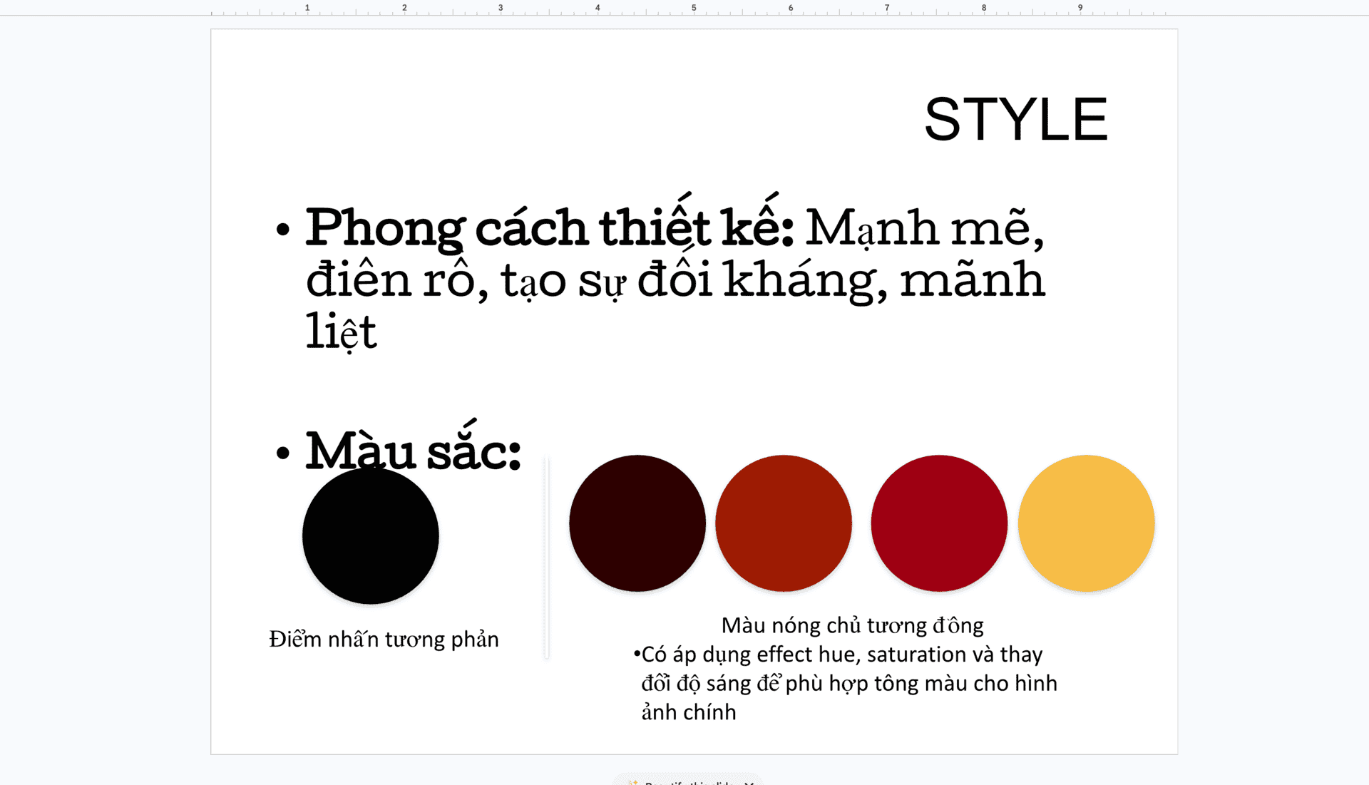
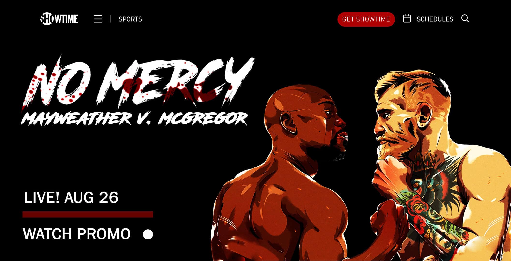
Based on what I learned about color theory, warm tones and high contrast were chosen to convey more powerful, passionate emotions like hate.
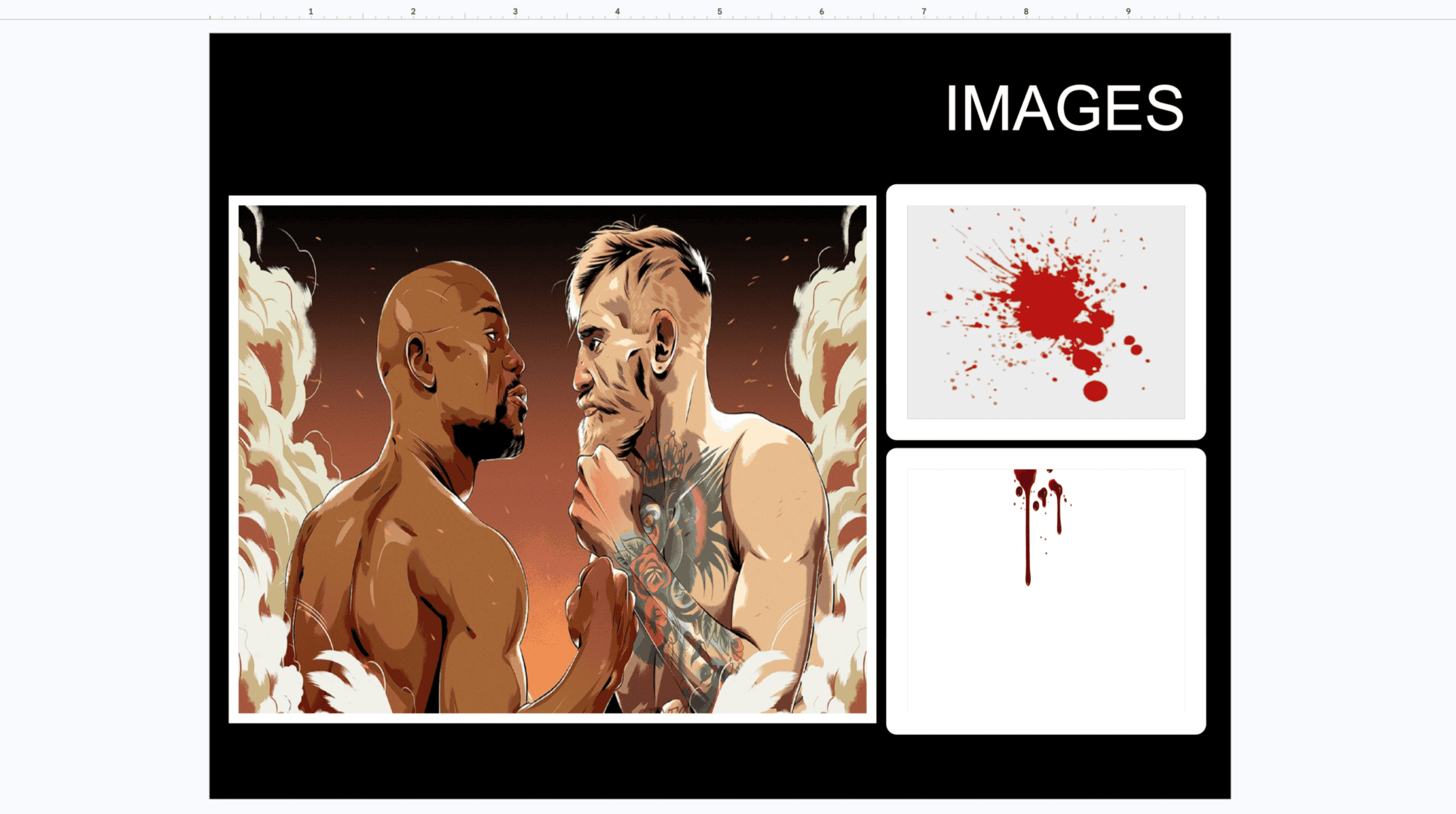
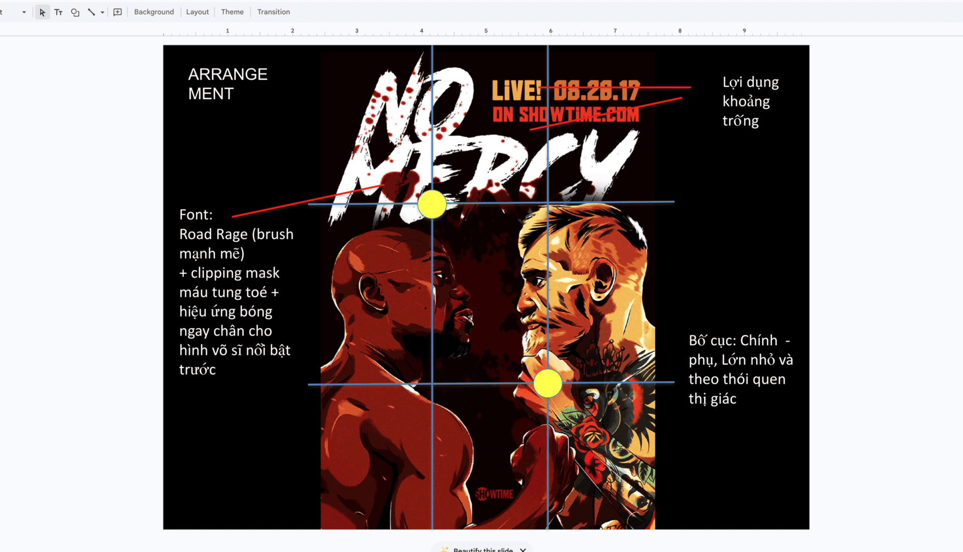
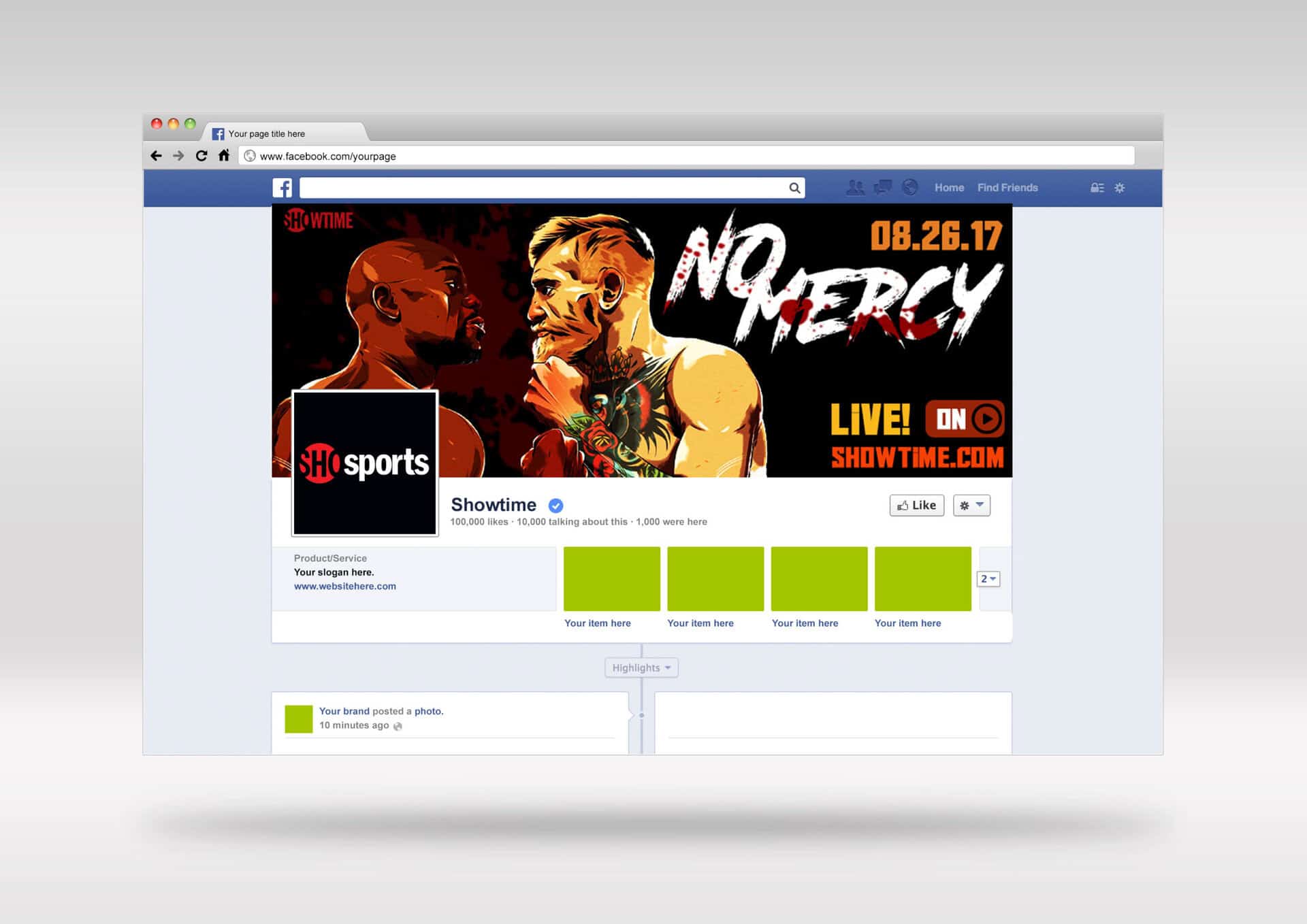
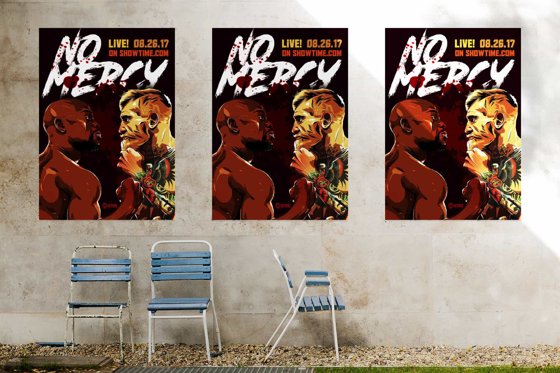
I used the Road Rage font for the headline, which had a splatter-style brush that was very fitting. Some blood was added as a clipping mask to accentuate the gore. I learned how to extract the illustration below from its original background using Photoshop to use as the base of my design as well.
The poster arrangement was intentionally cramped and spaces were added only to add some break for important visuals and information. The layout implemented a visual hierarchy that strictly follow how human users scan (from left to right, and from top to bottom). The rule of thirds in visual design was the foundation for the final layout.
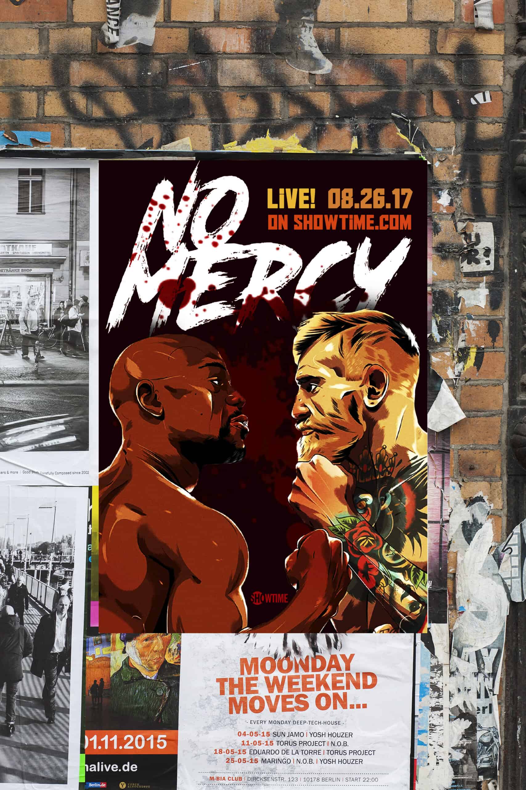
I also wanted to go beyond what was taught in the class, and learned how to create Smart Objects on Photoshop and use mockups to give life to my designs.
Deliverables
Outcome
I presented the final deliverables in front a panel of 3 instructors and our classroom, detailing my thought and design process. The design was voted best Presentation/Design and I got an award for it which was a little bit exciting and a whole lot rewarding for someone who had never done any graphic design work prior.

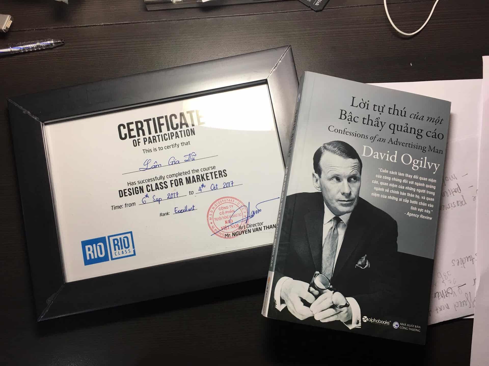
The skills I learned, along with the hands-on experience from weeks of practicing, serve as a core foundation to my career today. I have gone on to design many many more marketing materials, websites, UIs, product features in my work since 2017.